Thursday, March 31, 2011
GameFAN issue 5
Excuse the late nature of this entry, it took a while getting the issue over from the US, and when I did get my camera was on hiatus for three weeks (the French mag entry was photographed a few weeks before I put it up). Still, now my camera is back and regular posting of photos can commend.
.
.
.
Although its release has been sporadic, the new GF issue did make it to stores. This is the year in review issue and as always it looks damn fine. It’s always good to see a magazine with a regular artist on board, as showcased by Rob Duenas’ original Splatterhouse painting.
Because I’ve taken so long to write about this most of the content isn’t up-to-date, but you can see the reviewed games on the Viewpoint page.
My favourite thing this issue was the massive Retro City Rampage interview, since the game continues to look better and better.
Gotta love the Donkey Kong coverage too – I wasn’t so interested in the game before, but the ensuing pages help generate excitement for the game.
Their year-in-review awards list is interesting, since I’ve been comparing them across various websites and magazines. Considering how many awards Red Dead and Mass Effect have been getting, from everyone across the world, perhaps I should finally take the plunge and try one (probably Mass Effect 2, because some people have compared it to Star Control 2).
My only criticism? No mention of Deadly Premonition anywhere in the list. That was my 2010 GOTY.
Monday, March 28, 2011
HG101 Presents: The Guide to Classic Graphic Adventures
So, in the past I've made passing references to a book I've been working on, putting out calls for submissions and sticking up a placeholder page. Well, after two and a half years of work, we're putting the finishing touches on HG101 Presents: The Guide to Classic Graphic Adventures. It's an ode to one of the oldest genres in electronic gaming. It is over 760 pages in length, covers nearly 300 games and includes a number of interviews with classic game developers. It is an expansive tome, jam packed to the brim with history, criticism, and trivia. If you've ever asked the question "If I like LucasArts and Sierra games, what other games should I play?", then this book should be your bible.
As of current planning, the book should be available by late April. The physical copy will cost $27 from Amazon (and qualifies for free super saver shipping), while an e-book for the Kindle will cost about $10. For right now, the physical copy is only technically available on the US Amazon site due to constraints with Createspace, the print-on-demand publisher I'm using, though copies tend to filter to international sites like Amazon UK over the course of a few weeks. The Amazon US site should ship overseas, though.
Please check out the HG101 Presents: The Guide to Classic Graphic Adventures page for a full table of contents, as well as some history behind the project, what our goals were, what it entails and why the coverage was shifting towards adventure games (and PC titles) for quite a while. Hopefully this will be first in a series of gigantic catalogs of retro gaming! Here is a sample PDF of roughly 30 pages or so.
Saturday, March 26, 2011
Update - 3/26 - Nier, Guwange, Zelda's Adventure, Front Mission update
Last year, cavia's Nier surprised everyone by being a damn fine piece of work, not only for being a classy action-RPG with bounding amounts of creativity, but for being a Japanese game that wasn't terribly written. As far as anyone can tell, it kinda flopped, partially due to lousy marketing and critics who totally misunderstood it, reasons which are all outlined in the article. I ended up getting about halfway through the game before I got distracted, but even putting it back in to take some screenshots, there's a certain dream-like quality to the game, a large part in due to the fantastic soundtrack.
Our Cave coverage is also expanding with a look at Guwange, which was released for the Xbox Live Arcade at the end of last year. It can be had for $10 and is most definitely worth it - I hadn't played a whole lot of it until this came out, even though it's been emulated in MAME for years, but it's probably one of Cave's most unique shooters.
Derboo is hard at work in the second part of his massive History of Korean Games feature. His latest entry is an extensive interview with Mirinae Software, one of the most prolific companies in the 90s.
This site has apparently become somewhat infamous for being one of the few places to defend the silly looking Zelda CDi games, a position I'm willing to take because, as the article says, most of the people up in arms have never actually played them. However, this only applies to The Wand of Gamelon and The Faces of Evil. Zelda's Adventure is a right old piece of garbage, and you can read here to find out why!
We're bringing back the Spotlight Articles for a bit, this time to update the Front Mission article, which includes a review of the recent Western-developed Front Mission Evolved. A lot of longtime fans blew their gasket when this was announced to leave behind its SRPG roots in favor of the ever-popular third person shooter genre, but the review treats it fairly, even though it's still underwhelming. It's not like a genre shift is without precedent, considering Front Mission: Gun Hazard for the Super Famicom was a side-scrolling platformer. I still haven't played Evolved, but I can understand why people are miffed, especially since Square-Enix neglected to bring Front Mission 5 here, despite being one of the best SRPGs of the last generation.
Friday, March 25, 2011
Mamoru-Kun PSN Demo now available
The upcoming PS3 port of Mamoru-kun ha Norowareteshimatta (Mamoru-kun has been cursed) now has a demo available on the Japanese PSN. It's best if you grab it now, since the Ryu Ga Gotoku Of The End demo was removed after only a week or two, and that was before the Tohoku Earthquakes. Not sure what good releasing and taking down a demo for a game before it's release does. I've also noticed the Catherine demo has disappeared which is a real shame.
In happier news there is a collection of free Malicious avatars. I'll talk about the new and supposedly improved Malicious camera soon too.
Mamoru-kun PS3 official site
In happier news there is a collection of free Malicious avatars. I'll talk about the new and supposedly improved Malicious camera soon too.
Mamoru-kun PS3 official site
Mirinae Interview
I told you there'd be something special for fortnightly Korean gaming stuff soon, and here it is. We've contacted Kim Kyongsoo and Kim Seongwan, who both formerly worked at Mirinae Software and were eager to share their memories with us. Besides lots of interesting facts about what once was the most representative Korean game developer, there's a lot of insights into how the Korean gaming industry worked and works as a whole, as well as many pieces of concept art and stuff, partly provided by the interview partners and partly retrieved from old magazines.
To avoid having to make compromises with the layout, I've coded it directly in html, so you can read the interview here.
In addition, most of the existing Korean Gaming History article has been tweaked and updated with dozens of new advertisements, covers and screenshots. Part 2 is making slow but steady progress, and there should at least be one larger batch of company profiles before Duke Nukem Forever comes out.
Labels:
developer interviews,
history,
import games,
Korea,
Mirinae
Thursday, March 24, 2011
Guardian Legend across the world
After discovering an interesting topic on HG101’s forums, I bring you a selection of awesome Guardian Legend boxart trivia. Plus, semi-erotic imagery from various artists – there aren’t any nipples, but consider this entry and every single hyperlink in it, totally Not Safe For Work. Unless you work in the erotica industry, in which case far out, man, rock on.
.
.
.
I’d actually been thinking about the Guardian Legend artwork for some time now, since I’m fascinated by the changes made to cover art as games are released in Japan, America and Europe. Mainly I don’t get it. I lack the business acumen to understand how changing something which looks beautiful, into something which looks shit, will somehow equal more money (a case in point being Ico’s US cover – Jesus Christ!). Unless I’m trapped in some kind of warped reality where human beings prefer to consume garbage than quality – but I prefer to think this isn’t the case.
The implication of having three separate covers for each region is that on a fundamental level, the culture, views and cognitive functions of people in these areas must be different. Right? I mean, this thing almost warrants an anthropological study in order to understand. Is our ability to comprehend artwork (and I specifically mean the paintings which adorn media packaging) really so intrinsically linked to where we live? Guardian Legend’s three variations aren’t actually as bad as other NES examples, and as beach1 said on the forums, in their own way they’re each kind of cool – as I’ll demonstrate.
But even so, I still have to ask: when the executives at Broderbund USA walked into that morning office meeting, and were discussing their intent to publish Legend of Goardic by Compile in the US, under the title of Guardian Legend, did they have the Japanese artwork to look at? Did someone in that meeting look at the cover at the top of this blog entry and say: “Look guys, this, whatever the fuck it is, looks like shit. We’re gonna have to change it.”
I mean, really? In 1989 were US executives really so narrow minded? Was there genuinely the perception that people would ignore the game, unless it had the cover which eventually graced the US version? Sci-fi was a well established genre at the time, moreover it has a slight HR Geiger style which I would have assumed the public was aware of, what with the release of the Alien films. As a former art student and someone who appreciates hand-painted artistry, I am wholly unable to comprehend the mental framework of someone who would look at the Japanese original and say: “This is not good enough.” Because, I would argue, it is flawless.
The American cover we ended up with isn’t awful, it’s not great but it’s not Mega Man bad, where I swear the executive got his 7-year-old son to draw the cover. Dire51 on the forum revealed some info on the US cover, including its inspiration: “Thanks to an unrelated thread on my board, I think I've finally uncovered the inspiration for the (frankly disappointing) U.S. The Guardian Legend boxart. Here, you be the judge. Taken from the 1985 film, Creature. I have no idea who the box art designer for Broderbund was, but the two pieces of art look so similar that it can't be a coincidence. I used the word ‘inspiration’ because it doesn't appear to be a direct lift from the Creature poster, unlike the cover of Contra, for example, where the artist directly lifted Schwarzenegger's body from Predator's poster and placed Bill's head on it. Someone posted the Creature poster on my board in a thread about horror films, and when I saw it, I was immediately reminded of TGL’s boxart. When I compared the two, the resemblance was too similar to be a coincidence. Since Creature predated TGL by a couple of years, I wouldn't be surprised if the American artist used Creature's poster as his "inspiration," much like other game artists used other movie posters for "inspiration;" the example I gave about Contra being the first one that came to mind.”
Pretty obvious, huh readers? The Creature entry at IMDB.
Which leads us on to the European box art. Take a look.
Now to me, I see a strong connection to Capcom’s European Mega Man 2 boxart, with the same airbrushed shiny-metal styling. And also the Turrican box art from over the years. Take a look.
The two Western Guardian Legend covers are... alright. Although I prefer the Japanese boxart, I’d say the Euro and US art is about as good or as bad each other, for different reasons. The Euro box is a little too “safe” for my taste, but it still conveys the sci-fi theme in a reasonable way.
What I find especially interesting, it that it seems heavily inspired by the sci-fi art of Hajime Sorayama, especially his mostly hot hypersexualised Gynoid series (which is definitely NSFW if you're googling). Just take a look at these two pieces of Sorayama's Gynoid art, and tell me that whoever drew the Euro GL box wasn’t at least aware of him? (and as for Mega Man 2, if Sorayama didn't do it, then the guy who did totally ripped off his style!)
And that’s the man himself, from his website (NSFW). I checked, and while he has been commissioned to do stuff for Heavy Metal magazine, and other media, he doesn’t make mention of any videogames. Maybe he even did do the art for GL, but I can’t verify this.
Which leads us on to the Japanese artwork, shown here again.
Now, I’d always thought this was by Oscar Chichoni, an Argentinian artist famed for his totally awesome sci-fi art, often but not always featuring attractive women. His official website (NSFW).
Sega often commissioned Boris Vallejo to do covers, and on one occasion Moebius, and these covers were always some of the best. So Compile commissioning Chichoni seemed well within the realm of possibility. Check out two examples of his artwork below, which bear a similar style to that of GL's JPN cover. I would post more, but several feature nipples, and as has been explained to me, in the US showing nipples is a major no-no, especially in order to keep this blog relatively clean. Still, Google his covers for Fierro or Heavy Metal magazine, and tell me that stuff isn’t seriously hot, in a slightly twisted way.
Anyway, as Wildcat on the forum pointed out, it was actually a famed Japanese artist who did the art for the Japanese cover: “Hopefully a thread resurrection is okay, as I wanted to point out that the Japanese box art was done by Naoyuki Kato, who works for Studio Nue (scroll down a bit on the link to see where I got this from). They've made Macross, Space Battleship Yamato, and The Vision of Escaflowne, among others, and also helped From Software with their Armored Core games and contributed to Platinum Games' Infinite Space, too. I like the Japanese box the most myself. While none of them quite sync up to Miria/Alyssa's design in the game, it's the most interesting to me.”
A google for Naoyuki Kato (use the kanji: åŠ è—¤ç›´ä¹‹) reveals a lot of his awesome art (and sketches of himself, above), with a strong emphasis on mechanical contraptions and a style fairly similar to Chichoni’s. At the very least, I’m sure you can see how I could have mistaken one for the other when previously uninformed on the matter. Some of Kato’s stuff is also pretty damn hot - Google his cover for the fiction novel Star Courier, if you want to see a naked sword-wielding chick in leather boots.
Looking over the three covers for Guardian Legend, they each have merit and, at least in the case of the Euro and Japanese versions, tried to instil a sense of genuine artistic quality. There is a large world of skilled artists out there, and their commission charges aren’t that prohibitive, so why is it we see so much CG rendered crap on our covers today? Do you, as gamers, really feel more inclined to part with money when seeing these CG covers, as opposed to the quality put out by skilled artists?
Games are the realm of sci-fi and fantasy, we should be revelling in this with every game adorned by some fantastic painted artwork. Except most cover art today sucks, and appears put together by the 3D rendering dude who did the title screen, as opposed to traditional artists.
My request for Mass Effect 3 and any other sci-fi game: get Chichoni to do the cover, and tell him to make it sexy.
EDIT:
I didn't realise this, but Wildcat who made the original post about Naoyuki, also runs a blog which looks at cover art differences, and is also an anthropology student. Lots of references, plenty of insight, and all round totally awesome. Well worth a look:
LINK HERE
.
.
.
I’d actually been thinking about the Guardian Legend artwork for some time now, since I’m fascinated by the changes made to cover art as games are released in Japan, America and Europe. Mainly I don’t get it. I lack the business acumen to understand how changing something which looks beautiful, into something which looks shit, will somehow equal more money (a case in point being Ico’s US cover – Jesus Christ!). Unless I’m trapped in some kind of warped reality where human beings prefer to consume garbage than quality – but I prefer to think this isn’t the case.
The implication of having three separate covers for each region is that on a fundamental level, the culture, views and cognitive functions of people in these areas must be different. Right? I mean, this thing almost warrants an anthropological study in order to understand. Is our ability to comprehend artwork (and I specifically mean the paintings which adorn media packaging) really so intrinsically linked to where we live? Guardian Legend’s three variations aren’t actually as bad as other NES examples, and as beach1 said on the forums, in their own way they’re each kind of cool – as I’ll demonstrate.
But even so, I still have to ask: when the executives at Broderbund USA walked into that morning office meeting, and were discussing their intent to publish Legend of Goardic by Compile in the US, under the title of Guardian Legend, did they have the Japanese artwork to look at? Did someone in that meeting look at the cover at the top of this blog entry and say: “Look guys, this, whatever the fuck it is, looks like shit. We’re gonna have to change it.”
I mean, really? In 1989 were US executives really so narrow minded? Was there genuinely the perception that people would ignore the game, unless it had the cover which eventually graced the US version? Sci-fi was a well established genre at the time, moreover it has a slight HR Geiger style which I would have assumed the public was aware of, what with the release of the Alien films. As a former art student and someone who appreciates hand-painted artistry, I am wholly unable to comprehend the mental framework of someone who would look at the Japanese original and say: “This is not good enough.” Because, I would argue, it is flawless.
The American cover we ended up with isn’t awful, it’s not great but it’s not Mega Man bad, where I swear the executive got his 7-year-old son to draw the cover. Dire51 on the forum revealed some info on the US cover, including its inspiration: “Thanks to an unrelated thread on my board, I think I've finally uncovered the inspiration for the (frankly disappointing) U.S. The Guardian Legend boxart. Here, you be the judge. Taken from the 1985 film, Creature. I have no idea who the box art designer for Broderbund was, but the two pieces of art look so similar that it can't be a coincidence. I used the word ‘inspiration’ because it doesn't appear to be a direct lift from the Creature poster, unlike the cover of Contra, for example, where the artist directly lifted Schwarzenegger's body from Predator's poster and placed Bill's head on it. Someone posted the Creature poster on my board in a thread about horror films, and when I saw it, I was immediately reminded of TGL’s boxart. When I compared the two, the resemblance was too similar to be a coincidence. Since Creature predated TGL by a couple of years, I wouldn't be surprised if the American artist used Creature's poster as his "inspiration," much like other game artists used other movie posters for "inspiration;" the example I gave about Contra being the first one that came to mind.”
Pretty obvious, huh readers? The Creature entry at IMDB.
Which leads us on to the European box art. Take a look.
Now to me, I see a strong connection to Capcom’s European Mega Man 2 boxart, with the same airbrushed shiny-metal styling. And also the Turrican box art from over the years. Take a look.
The two Western Guardian Legend covers are... alright. Although I prefer the Japanese boxart, I’d say the Euro and US art is about as good or as bad each other, for different reasons. The Euro box is a little too “safe” for my taste, but it still conveys the sci-fi theme in a reasonable way.
What I find especially interesting, it that it seems heavily inspired by the sci-fi art of Hajime Sorayama, especially his mostly hot hypersexualised Gynoid series (which is definitely NSFW if you're googling). Just take a look at these two pieces of Sorayama's Gynoid art, and tell me that whoever drew the Euro GL box wasn’t at least aware of him? (and as for Mega Man 2, if Sorayama didn't do it, then the guy who did totally ripped off his style!)
And that’s the man himself, from his website (NSFW). I checked, and while he has been commissioned to do stuff for Heavy Metal magazine, and other media, he doesn’t make mention of any videogames. Maybe he even did do the art for GL, but I can’t verify this.
Which leads us on to the Japanese artwork, shown here again.
Now, I’d always thought this was by Oscar Chichoni, an Argentinian artist famed for his totally awesome sci-fi art, often but not always featuring attractive women. His official website (NSFW).
Sega often commissioned Boris Vallejo to do covers, and on one occasion Moebius, and these covers were always some of the best. So Compile commissioning Chichoni seemed well within the realm of possibility. Check out two examples of his artwork below, which bear a similar style to that of GL's JPN cover. I would post more, but several feature nipples, and as has been explained to me, in the US showing nipples is a major no-no, especially in order to keep this blog relatively clean. Still, Google his covers for Fierro or Heavy Metal magazine, and tell me that stuff isn’t seriously hot, in a slightly twisted way.
Anyway, as Wildcat on the forum pointed out, it was actually a famed Japanese artist who did the art for the Japanese cover: “Hopefully a thread resurrection is okay, as I wanted to point out that the Japanese box art was done by Naoyuki Kato, who works for Studio Nue (scroll down a bit on the link to see where I got this from). They've made Macross, Space Battleship Yamato, and The Vision of Escaflowne, among others, and also helped From Software with their Armored Core games and contributed to Platinum Games' Infinite Space, too. I like the Japanese box the most myself. While none of them quite sync up to Miria/Alyssa's design in the game, it's the most interesting to me.”
A google for Naoyuki Kato (use the kanji: åŠ è—¤ç›´ä¹‹) reveals a lot of his awesome art (and sketches of himself, above), with a strong emphasis on mechanical contraptions and a style fairly similar to Chichoni’s. At the very least, I’m sure you can see how I could have mistaken one for the other when previously uninformed on the matter. Some of Kato’s stuff is also pretty damn hot - Google his cover for the fiction novel Star Courier, if you want to see a naked sword-wielding chick in leather boots.
Looking over the three covers for Guardian Legend, they each have merit and, at least in the case of the Euro and Japanese versions, tried to instil a sense of genuine artistic quality. There is a large world of skilled artists out there, and their commission charges aren’t that prohibitive, so why is it we see so much CG rendered crap on our covers today? Do you, as gamers, really feel more inclined to part with money when seeing these CG covers, as opposed to the quality put out by skilled artists?
Games are the realm of sci-fi and fantasy, we should be revelling in this with every game adorned by some fantastic painted artwork. Except most cover art today sucks, and appears put together by the 3D rendering dude who did the title screen, as opposed to traditional artists.
My request for Mass Effect 3 and any other sci-fi game: get Chichoni to do the cover, and tell him to make it sexy.
EDIT:
I didn't realise this, but Wildcat who made the original post about Naoyuki, also runs a blog which looks at cover art differences, and is also an anthropology student. Lots of references, plenty of insight, and all round totally awesome. Well worth a look:
LINK HERE
Sunday, March 20, 2011
Parasite Eve & Tango and Cash?
We're not had an update in a couple of days, so just before we do the HG101 update entry (I've seen some nice articles planned), let me squeeze this bit of ridiculous nonsense in. Parasite Eve was recently released on PSN, which I've been enjoying the hell out of (despite not being able to skip cut-scenes). I first played the Japanese import back in the day when a guy brought his chipped PS1 to school and we spent several lunchtimes at school going through it - this was my first my time playing it in English, and while it somehow seems drastically different from those halcyon high-school days, I did notice something: the whole time while playing, the Missing Perspective theme in PE sounded very similar to the main theme from Tango and Cash. Just a few of the opening chords, maybe if you sped PE up bit... Anyone else agree? No...? Hmm, might just be me then.
Thursday, March 17, 2011
HG101 glitches #1: Ys IV Mask of the Sun (SFC)
In what is likely NEVER to become a regular column, I document an interesting glitch I found in Ys IV on the Super Famicom, and reveal a little of my warped logic in the process.
.
.
.
Whenever I play a game I have an inherent distrust of the designers, believing them to be in many instances trying to bamboozle me with their fiendish trickeries. A good example was in the original Yakuza. I came across a sobbing man who called out a woman’s name, lamenting how he lost everything because of her. Five minutes later a mission triggered, where a woman ran up to me being chased by a thug – she told me her name, the same exact same one the old man had mumbled, and begged me to save her. I thought aha! The game is trying to trick me, and if I save her I’ll lose everything too. I had assumed that the NPC was giving a warning for wary players, so I let her get dragged off. As it turns out you were supposed to save her and then lose everything, and in avoiding this fate I would never gain access to one of the game’s secret casinos. So in disgust I stopped playing and never completed the original Yakuza. It had clearly given me a warning which I had followed, and instead of being rewarded for my astute vigilance, I was punished.
Anyway, this highlights how an obsessively astute nature can disrupt game flow. As it did in Ys IV on the SFC.
At the start of Ys IV Dr Flair joins you, stating he intends to find a rare flower to create a special panacea. He lodges at the first inn you come across and stays there while you go off on your adventure. Most players would forget about this, but for me this mentioning of the flower took precedence over all other things – if it wasn’t to become a pivotal point of the game, it wouldn’t have been mentioned. Most writers avoid creating a “dues ex machina” situation by casually dropping something significant at the start of books, films and games. So when someone mentions being double-jointed, a place of interest, a bottle of milk or packet of prophylactics they’re picking up, right at the start of any narrative, my assumption is that the final act of this narrative will somehow hinge upon this seemingly innocuous item/skill/location/etc, otherwise it would never have been mentioned. In fact 90% of all films are ruined for people who watch with me, precisely because I pin-point every key aspect which most of the time ends up correct thereby totally spoiling it ahead of time (except Morgan Freeman and his knife throwing in Seven – that never went anywhere, making it something of a red herring).
So anyway, when I finally find this flower late into the game, at an exorbitant price, from a merchant who only has one of them, and then I’m asked to give this flower to an old man whose wife needs it, my SPIDY NERD SENSES kick in, and I realise: Tonkin House is trying to **** with my mind, man. Of course they’d set up this situation where I need to take the game’s ONLY flower to a dying old woman, thereby denying Dr Flair the game’s ONLY flower, and thereby denying myself some kind of outlandish reward – like having the power of GOD, or something equally outlandish.
So in order to fulfil my Messiah Complex and best the game’s trickeries, the only logical thing is to abandon the old woman and trek it aaaaaaaaalllllll the way back to Dr Flair, across about 137 different map screens, in order to instead give HIM the ONLY flower, in the original inn he’s staying at, and get the super secret reward.
Right? Eh, readers?
I could have looked up a FAQ to check this, but I trusted my gut instinct.
My belief was that only the most astute (or paranoid) of players would make such a journey. And therefore only such gifted individuals would receive an unimaginably amazing reward. Because if I made commercial games, they would all be made like this, forcing players to constantly double guess me and break the design flow – because if I made commercial games, I would absolutely 100% of the time be ****ing with your mind. My games would literally be non-stop mind ****ing.
So I trek it back to Dr Flair, who is still inside the inn. After talking to him he starts spouting strange gibberish about coming here to find me, after finding the flower himself, and that he’d take me to the elder if I follow him. At which point he freezes in place and Adol starts walking around the scenery, only to end up stuck inside the background, as in the starting image. It even incorrectly says: Elder's House.
As it turns out, you’re not supposed to go back to Dr Flair. Giving the flower to the old woman sets a trigger which places Flair in the seaside village, whereupon he’ll take you to the elder. Failure to bring her the flower causes him to remain at the inn. The curious thing is though, at some point a different trigger must have been activated, whereupon instead of his usual “best wishes” dialogue he initiates the conversation about taking you to the elder. So there must be two triggers at work: (1) to alter his dialogue response and (2) to actually make him appear in the seaside town. By triggering (1) and skipping out (2), I was able to initiate the wrong conversation while still inside the inn, which of course resulted in Adol getting stuck.
The worrying thing is you can still save the game after this, so it is quite a fatal glitch.
I reloaded and did things properly, whereupon I discovered that Flair ended up getting the flower on his own, so Tonkin House wasn’t really messing with my mind and I could have just gone with the flow. Making it all a great waste of time...
See? You absolutely cannot trust games designers.
Wednesday, March 16, 2011
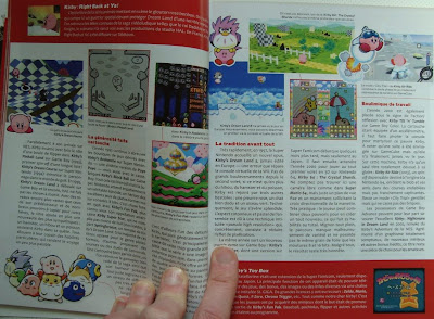
French games magazine IG
Some of may recall my previous post on French games magazines. Well, on a recent trip to Paris I decided to finally pick up a copy of IG. It's a bit expensive, and my French ability isn't fluent, but they have a number of interesting ideas UK and US magazines should make note of. Website link.
'
'
'
My favourite aspect is how they take a "whole history" view of games. If they cover a new game, like a Golden Sun title, immediately after it they'll have 2 pages covering the entire series, just to get you up to date.
They also give page time to free download games. Which is excellent, since while a lot of mags are starting to take indie games seriously, they tend to still focus on commercial indie games, whereas entirely free indie games get mostly overlooked. These two types of indie title are distinct - so much so that I think we really need a new nomenclature to describe each of them.
They also take a look beyond games, such as examining the artwork of Giorgio de Chirico, which was a major influence on ICO.
Overall a fascinating magazine. Design is a little bland, but the range of content is second to none. And the best part? The size. It's over 260 pages, without adverts.
Let me say that again: THERE IS NO ADVERTISING. This means they can't be held to ransom by publishers who threaten to pull ads. What a miracle! TWO HUNDRED AND SIXTY PAGES.
Monday, March 14, 2011
Update - 3/14 - Espgaluda, Black Heart, Limbo of the Lost
PAX East sorta screwed up the weekend update, but better late than never. Espgaluda is a Cave shooter, sort of a pseudo-sequel to ESP Ra. De. in that it borrows the whole "flying people" schtick, but other than borrowing a few elements, is largely its own game. The second game hit the Xbox 360 last year, which was region-free, and a decent port was recently published for the iOS worldwide. Lesser known is Black Heart, a side-scroller shooter starring a dragon-riding knight, made by the same folks as Saint Dragon. It's not too bad! But on the "actual bad" side is Your Weekly Kusoge, Limbo of the Lost, mostly known for stealing assets from at least a dozen other games. Even disregarding this, it's a hilariously bad adventure game in its own right.
Friday, March 11, 2011
Fortnightly Korean Gaming History Tidbits: Twins (1995)
For those of you who wondered: Yes, I am still working on the second part for my big article about Korean games, but it comes with so many company profiles and game introductions that I'm only about halfway done. And that is with the companies that mostly put out RPGs still in front of me, where one has to invest at least a good weekend's gaming time per title to even grasp what's going on.
To bridge the gap and to help keep me motivated, I've decided to post one bit of content I'm preparing for the article in regular intervals, preferably interesting stuff that is in danger of getting buried later in the pages and pages that make up the whole article. Starting with Twins, a DOS game that is technically already covered in the pages that are up so far, although only very briefly, with two awfully dark screenshots scanned from an old magazine ("real" screens are rather dark, too). Well, I've found the game in the meantime, inside is my take on it as it will appear in the article until whenever I get to upload the next batch of pages.
There's much left to do ...
Twins tells the story of the two small-time criminal brothers Na Daero and Na Gaeseong. While both in prison for minor delicts, they make plans for their big coup they intend to land as soon as they are released. They get overheard, however, by one mysterious Mr. X, who from now on crosses all their plans and takes away with their loot. A wild chase begins, in which the twins not only have to catch Mr. X, but are themselves once again hunted by the police.
Twins is one of the most interesting and unique old games that hail from the Korean peninsula. As an adventure game based on the interchanging use of multiple characters (two in this case), it compares to the Goblins series by Coktel Vision to some degree. Several style elements, like character "voices" and gestures, also betray the inspiration. Twins doesn't stop here, though, but introduces a lot of new elements. Most of the game takes place in adventure mode, but other than most adventure games the anti heroes are not controlled by pointing and clicking, but directly with the cursor keys. The stout Daero moves the most heavy objects around and is competent in using tools, Gaeseong instead is a swift and nimble pickpocket and athlete. The game in general demands good use of either character's skills. Only in two of the later stages the developers seem to have all but forgotten the concept of their game, as those can be completed entirely with only one of the brothers. Puzzles are never unfair or illogical, but at times the game is very specific about the exact position items have to be used in.
After most stages follows a direct confrontation with Mr. X, that is fought out — well, fighting game style. The controls are not very elaborate, but Deca team knew exactly what they could and couldn't do with the engine, so it controls better than many dedicated fighting games on PC at the time. Mr. X is vastly superior both in terms of health and attack power, but the two brothers can take turns to take him on, with the resting one slowly regenerating health.
Last are the driving stages, which are the most frustrating. The car controls feel a bit sedate, maneuvers like a u-turn are not possible. Nonetheless it's fun to avoid police cars after gathering some momentum. The brothers can even get out and go on by foot when the car is stuck, but it is all spoiled by how police officers are handled. It is not possible to go anywhere near them, even when in the car. Thus they have the protagonists cornered in no time.
Twins was developed by Deca Team (concept, program, sound) in cooperation with Neo Art (graphics). Only a year after releasing their first game, they got bought out by Jeibi Hitech, where they started to work on the SRPG Tartarus. Before that game was finished however, the studio changed owners once again, this time to Softry, where their next few games were completed. Members of Neo Art ended up at Games&Multimedia, to work on the popular RPG Protocoss.
By the way, either the next episode or the one after that will be particularly sweet, so stay tuned.
Subscribe to:
Posts (Atom)